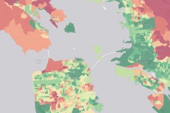
The first-of-its-kind interactive map was produced by the University of California, Berkeley’s CoolClimate Network and the Bay Area Air Quality Management District, and covers census block groups –neighborhoods of several hundred to a few thousand households – in the nine-county area. Neighborhoods with relatively high emissions for any component of their carbon footprints show up as red, while low-emission neighborhoods are green.
“This is the most granular carbon footprint assessment anywhere in the world,” said Christopher Jones [ERG MS, PhD 2015], the program director of the CoolClimate Network and first author of a study about the Bay Area carbon inventory. “It includes everything: energy use, transportation, food, goods, services, construction, water and waste. No one has compared neighborhoods like this before.”
Read the Berkeley News article